Sampler Comparison
The API is common to all back-end implementations. Each implementation has different strengths that balance performance and quality. These are all the implementations and their required header files:
oqmc/pmj.h: Includes low discrepancyoqmc::PmjSampler.oqmc/pmjbn.h: Includes blue noise variantoqmc::PmjBnSampler.oqmc/sobol.h: Includes Owen scrambledoqmc::SobolSampler.oqmc/sobolbn.h: Includes blue noise variantoqmc::SobolBnSampler.oqmc/lattice.h: Includes rank oneoqmc::LatticeSampler.oqmc/latticebn.h: Includes blue noise variantoqmc::LatticeBnSampler.oqmc/oqmc.h: Convenience header includes all implementations.
This diagram gives a high level view of the available implementations and how they relate to one another. Each implementation includes a blue noise variant which you can read more about here.
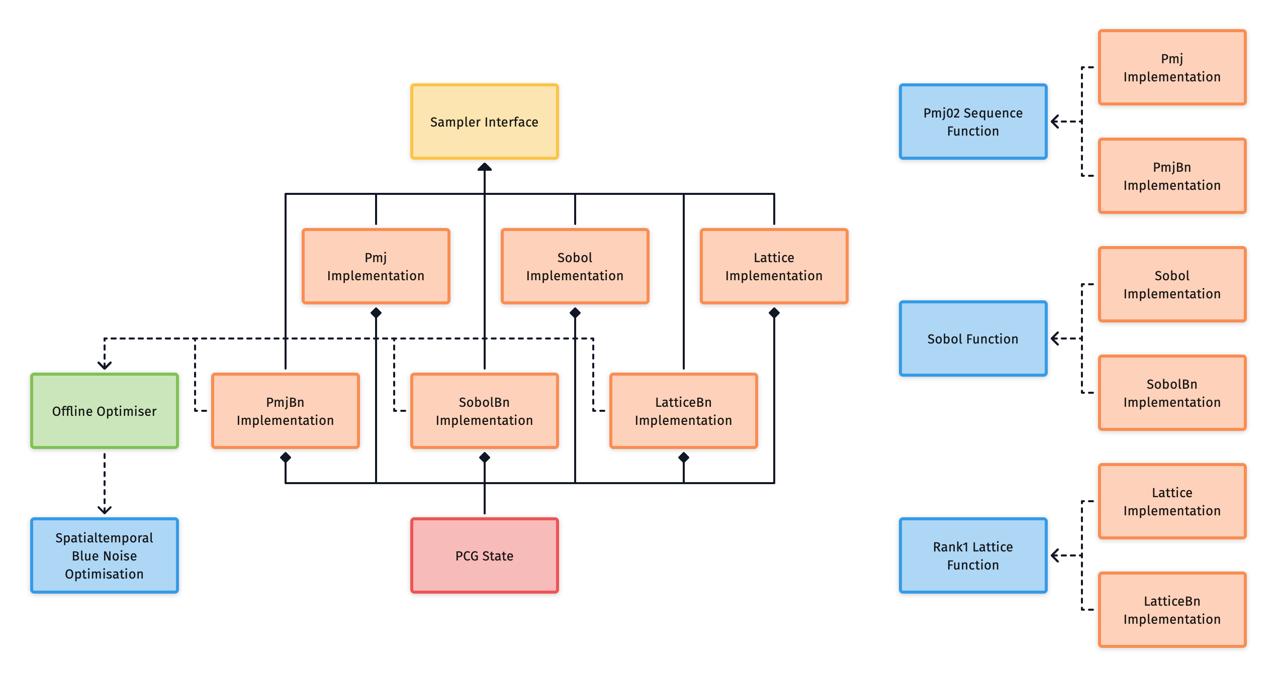
The following subsections will provide some analysis on each of the implementations and outline their tradeoffs, so that you can make an informed decision on what implementation would be best for your use case.
Rate of convergence
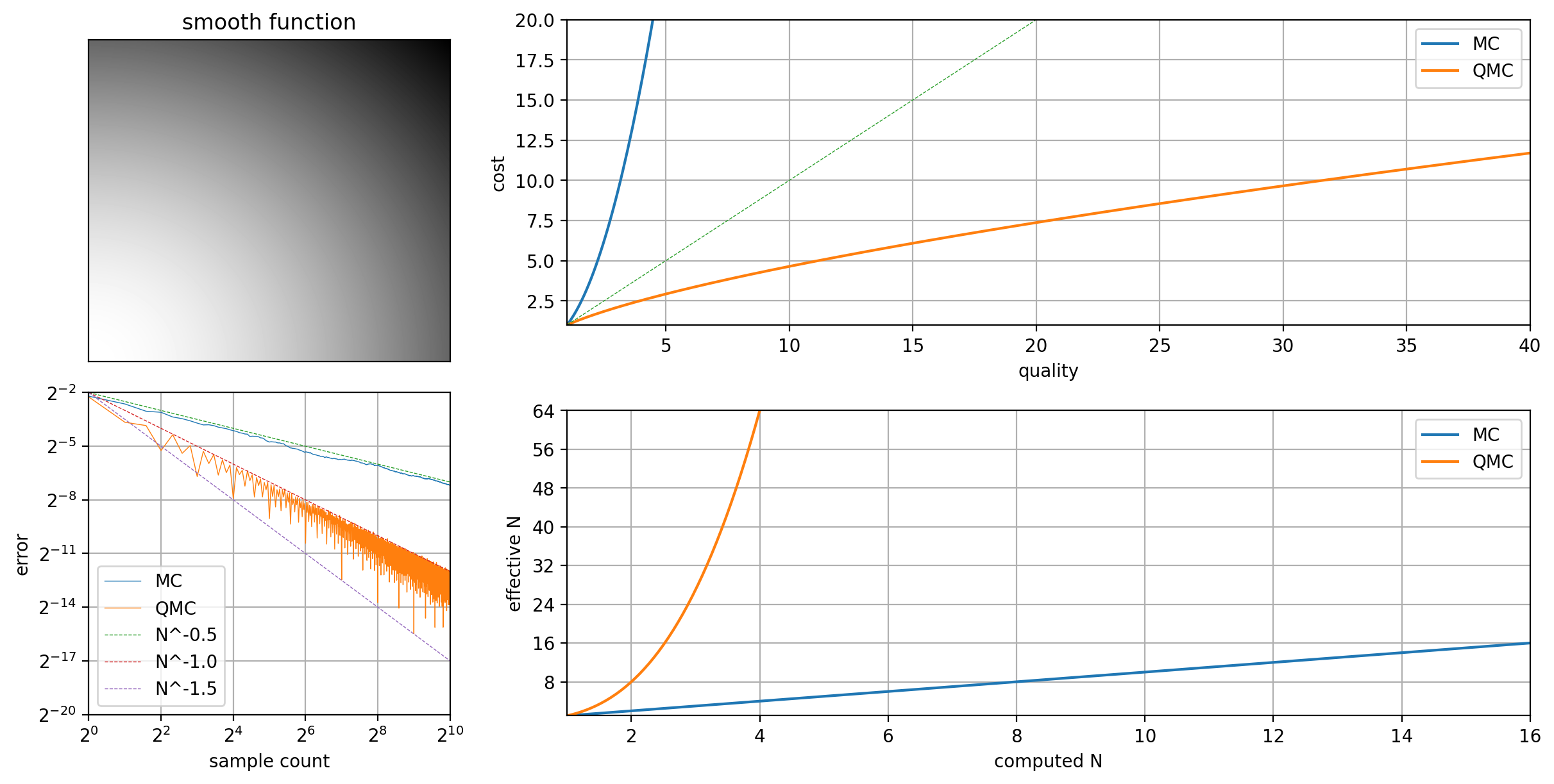
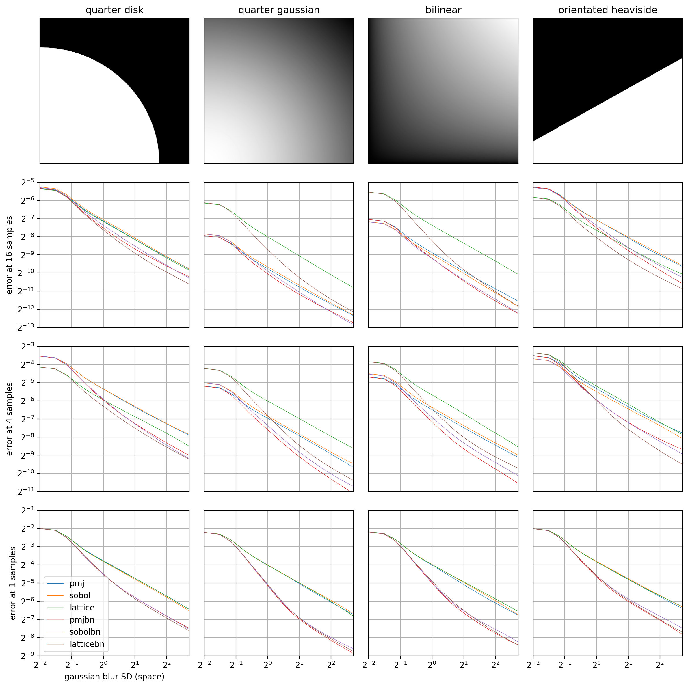
Unreasonable Effectiveness of QMC is a subject worth exploring. When discussing rates of convergence between different implementations, it can be helpful to have some context in how these relate to classic MC. The primary reason to use a QMC method in place of MC is the improvement it brings in convergence rate, and as a result a reduction in computational cost. The following figures illustrate this using a pmj sequence.
Here is an example of an estimator where \(x_i\) are points based on either an MC or QMC method. Given \(N\) points, measurements are taken from \(f\) and averaged to produce the final estimate:
Asymptotic complexity for a Monte Carlo (MC) estimator to converge on a true value is quadratic in cost:
While both these formulas are equivalent, the second gives some intuition about the terms that result from the original estimator. Central Limit Theorem (CLT) shows that the summation of i.i.d. variables approaches a convolution of normal distributions. This dispersion is represented in the numerator.
In comparison, asymptotic complexity for a Quasi Monte Carlo (QMC) estimator is much lower in cost:
More specifically, this is true for some Randomised Quasi Monte Carlo (RQMC) estimators when \(N\in\lbrace2^k|k\in\mathbb{N}\rbrace\) and \(f\) is smooth. The cost is no longer quadratic. Relative to MC, the efficiency factor is \(N^3\).
This improvement in efficiency is why QMC sampling becomes more critical with higher sample counts. For low sample counts, other features like blue noise dithering can have a greater impact on quality.
Practically we can't expect to always see such efficiency gains in real world scenarios. These results are the best case, and typically what you see only when the function is smooth. However, QMC is never worse than MC, and usually shows somewhere between a measurable improvement, and a considerable improvement as seen here.
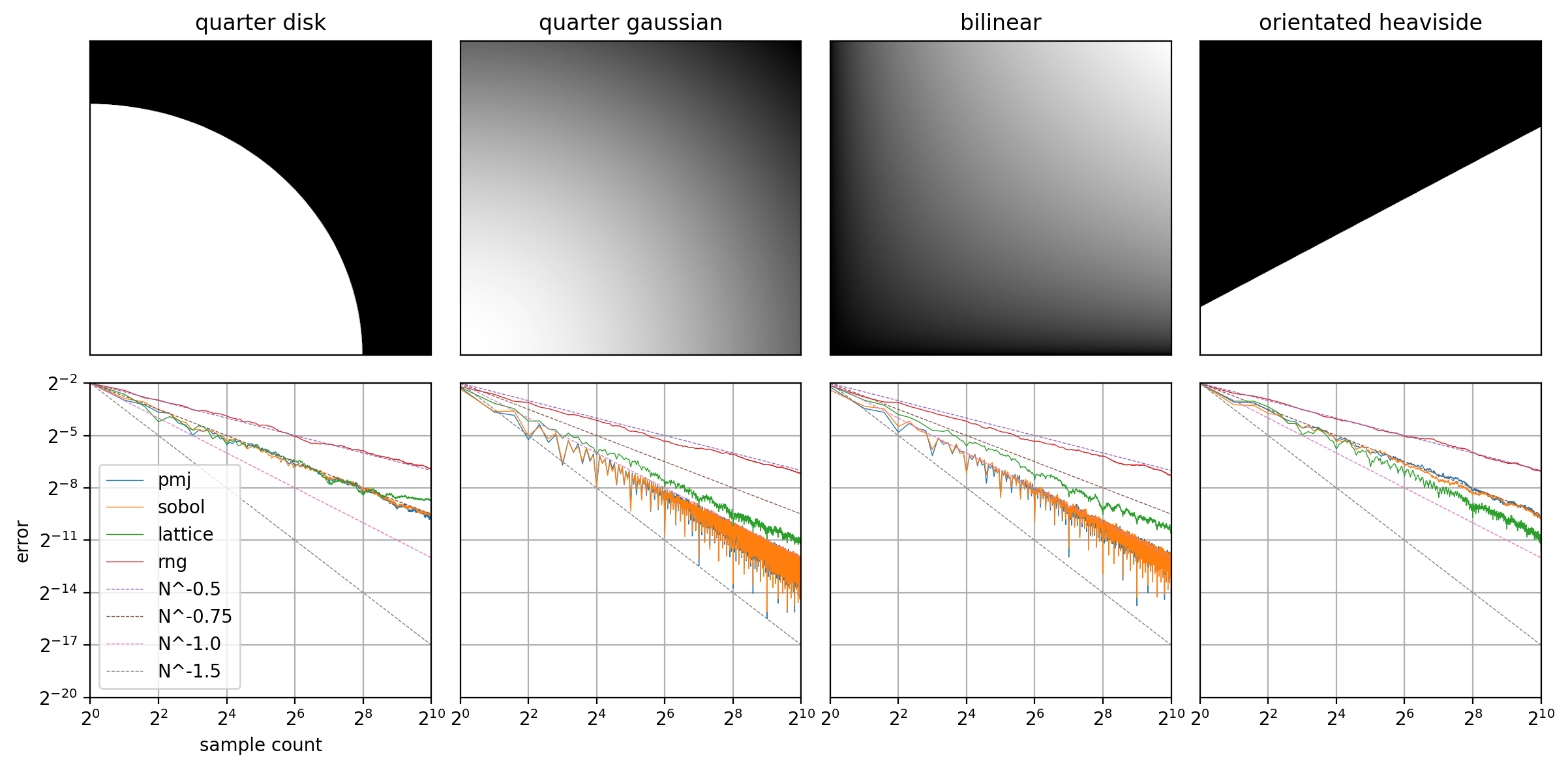
These plots show the rate of convergence for different implementations across different two-dimensional integrals. Each plot takes the average of 128 runs, plotting a data point for each sample count value.
The following plots show, for a fixed sample count, how the error decreases with a Gaussian filter as the standard deviation increases. It shows, especially for low sample counts, the faster convergence of the blue noise variants. This is an indicator that these may be a better option if your images are then filtered with a de-noise pass.
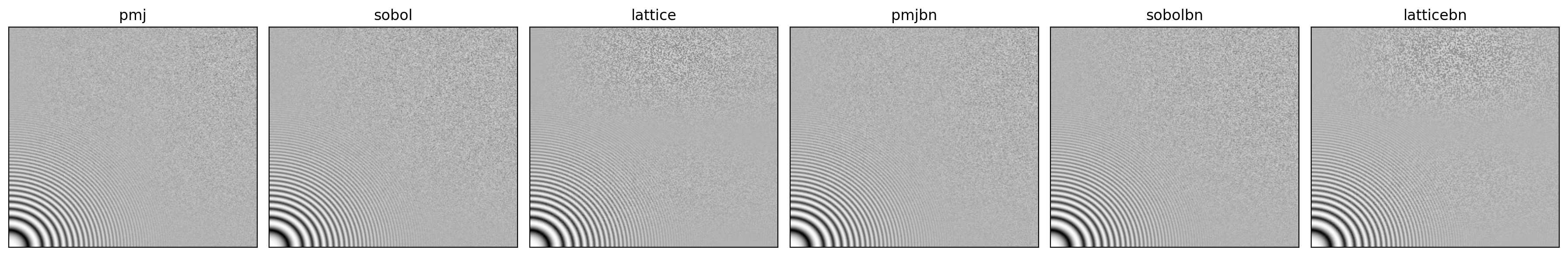
Zoneplates
These plots show zoneplate tests for each sampler implementation, and give an indication of any potential for structural aliasing across varying frequencies and directions. Often this manifests as a moiré pattern.
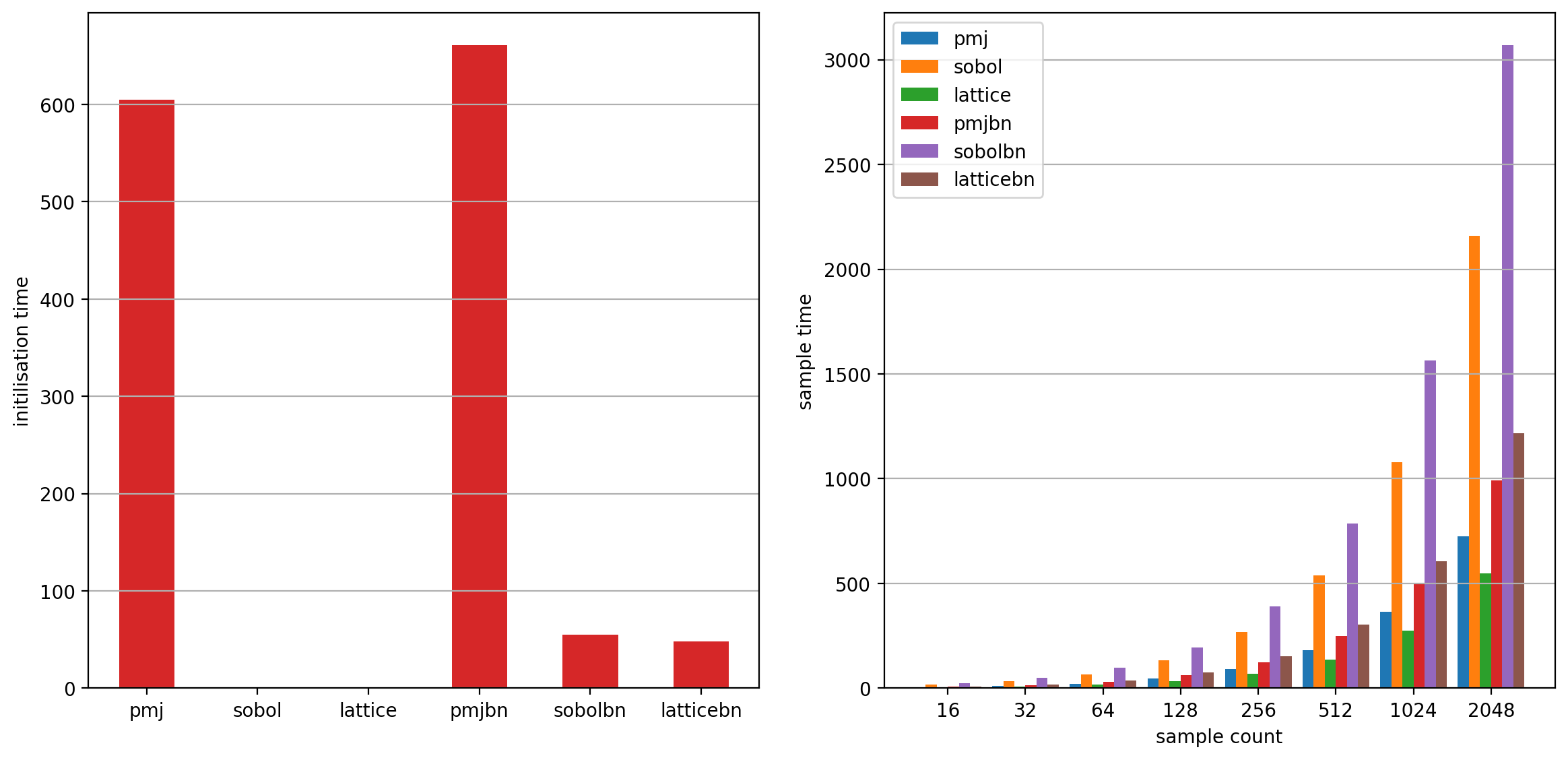
Performance
In these charts you can see the time it takes to compute N samples for each
implementation. Each sample takes 256 dimensions. It also shows the cost of
cache initialisation, this is often a trade-off for runtime performance. The
plot measured the results on an Apple Silicon M1 Max with OPENQMC_ARCH_TYPE
set to ARM for Neon intrinsics.
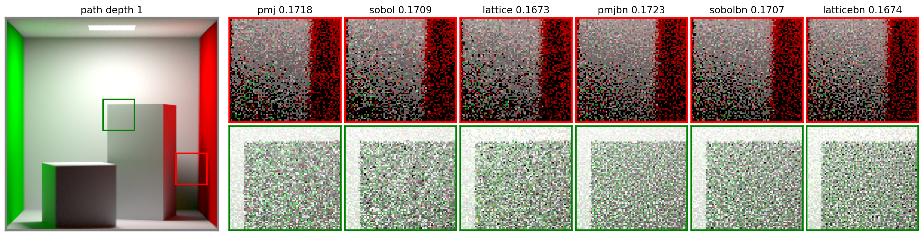
Pixel sampling
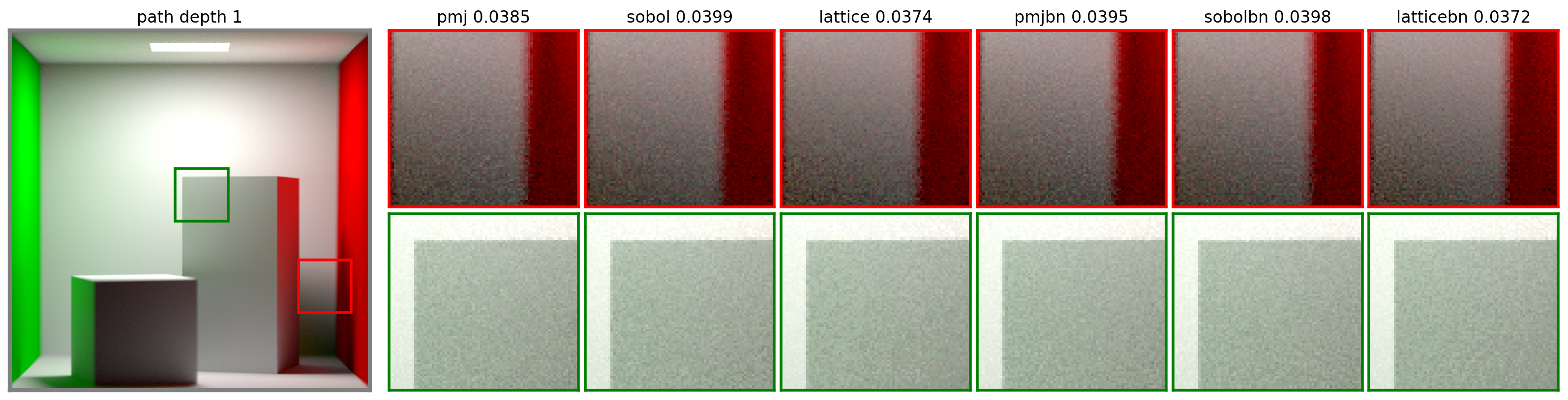
These are path-traced images of the Cornell box comparing the results from each implementation. The top row of insets shows pixel variance due to the visibility term; the bottom row shows the variance of sampling a light at a grazing angle. Each inset had 2 samples per pixel. Numbers indicate RMSE.
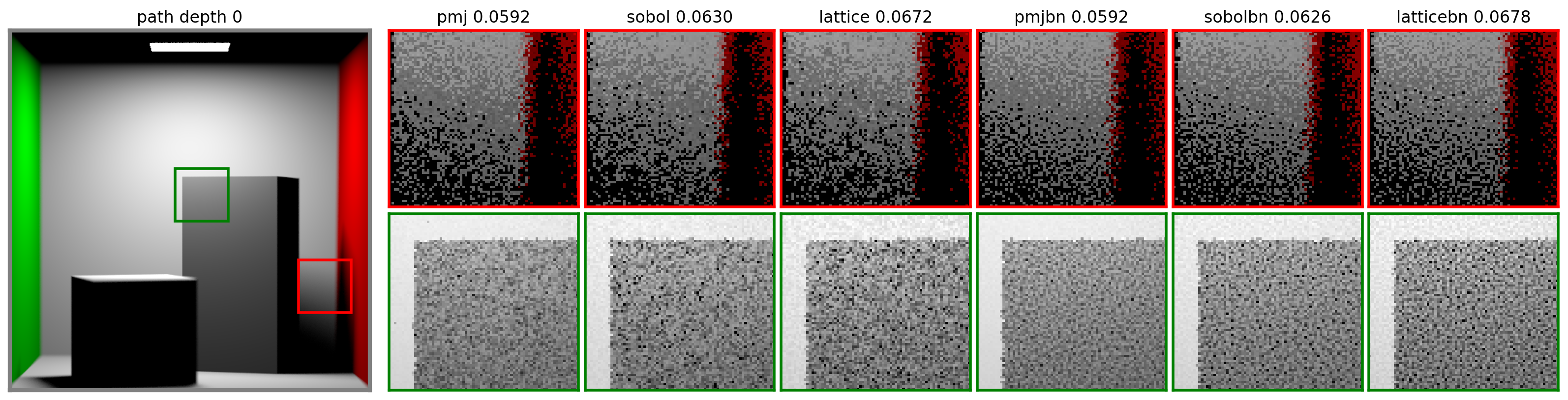
With higher sample counts per pixel (the results below are using 32 samples) the difference between the sampler implementations becomes greater as the higher rate of convergence takes effect.